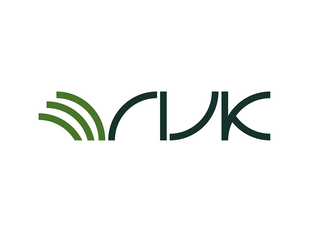
RIJK, Logo design
January 30, 2020

As a designer, there’s nothing quite as satisfying as seeing a complete corporate identity redesign come to life. I’m thrilled to share my recent work for Stichting RIJK, where I had the opportunity to revamp everything from their logo to their website and email signatures.
The Design Brief:
The client’s requirements for the new logo were clear:
- Create contrast with the previous logo
- Achieve an iconic look
- Incorporate smart design elements
- Maintain simplicity
Understanding RIJK’s Story:
Beyond these visual requirements, it was crucial to understand and reflect RIJK’s core business and values. As an organization that provides purchasing experts to Dutch municipalities, their story revolves around three key points:
- Personal approach
- Expertise
- Connecting stakeholders
The Logo Concept:
Focusing on the ‘connecting’ aspect of RIJK’s work, I designed a logo featuring quarter circles that visually represent connections. These round shapes also convey a sense of positivity and approachability. The green hues in the logo are reminiscent of grass, symbolizing the geographical areas where RIJK operates.
The logo isn’t immediately obvious – it invites viewers to look closer and investigate, embodying the ‘smart’ requirement from the brief.
Color Scheme:
The color palette draws heavily from natural grass tones, featuring:
- Diep Groen (Deep Green)
- Gras (Grass)
- Groei (Growth)
- Distel (Thistle)

I’ve also created greyscale and black & white versions of the logo for various applications.

Innovative Business Card Solution:
To add a modern touch, I designed personalized phone cases for RIJK employees, featuring a QR code that functions as a digital business card. This innovative approach combines practicality with a contemporary flair.
The Redesign Impact:
This comprehensive redesign touches every aspect of RIJK’s visual identity. From the logo that encapsulates their core values to the website that showcases their expertise, and even down to the email signatures, every element has been carefully crafted to reflect RIJK’s professional yet personal approach.
The new identity successfully:
- Creates a strong contrast with the previous branding
- Presents an iconic and memorable visual identity
- Incorporates smart design elements that invite engagement
- Maintains simplicity while conveying complex ideas
This project was a fantastic opportunity to demonstrate how thoughtful design can effectively communicate an organization’s values and services. I’m proud of the results and excited to see how this new identity will support RIJK’s future growth and success.
A novel way for a business card. Personalized phone case with business card QR code.

Website
